The dashboard made of pie charts
The statistics dashboard was pie charts nobody could read a trend from. I prototyped the replacement from the API contract and handed frontend a package they could build from.
- Context
- B2B SaaS, analytics dashboard
- Role
- Product Owner
- Date
- January 2026
The short version
- Result
- Frontend got a working prototype and its documentation, and no discovery slot was needed.
- What I did
- Prototyped the replacement for a pie chart dashboard from the backend API contract, with states, data shapes and edge cases.
- The call
- With no UX function and no free capacity, I built the prototype myself instead of queueing for a discovery slot.
What changed
A statistics dashboard built out of pie charts that no one could read a trend from, and no spare design or frontend capacity to fix it.
I prototyped the replacement from the backend API contract and handed frontend a working package with states, data shapes and edge cases included.
Problem
The statistics page was built out of pie charts, and its terminology didn't match how customers talked about a campaign, so nobody could read an outcome from it. The company had no UX function, so interaction and usability decisions sat with me. Frontend capacity was already spoken for, which made a redesign through the normal handover route slow. I wanted a faster route that still gave frontend something good to build from.
Approach
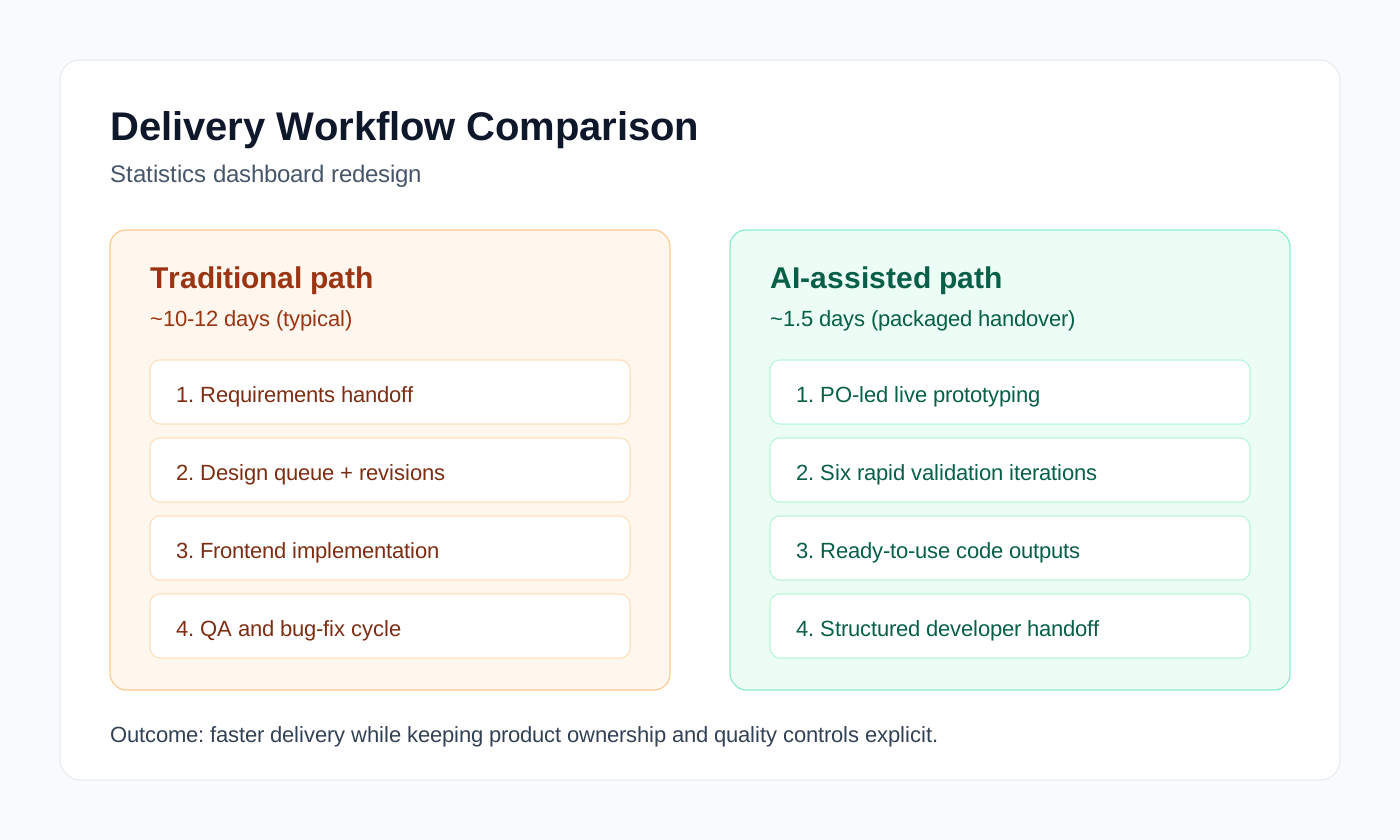
I prototyped the replacement myself. AI wrote the code, and I held the scope, the wording, the checks and what got handed over.
- Defined what a user should be able to read off the page, and the terminology rules
- Iterated in the browser on layout, chart behaviour and interaction details
- Pushed the edge cases, such as a campaign with many UTM sources, or what the PDF export does
- Packaged the result for frontend, with the open questions written down
What I learned
I set the constraints, checked the behaviour and wrote down the API questions I couldn't answer instead of guessing. Frontend got a working page and its documentation to build from.
The package would have been better with read access to the codebase. I had to ask developers which endpoints fed the statistics, which cost a round trip and left some questions open. With read access, and AI to help me read the code, I could have built the prototype on the real endpoint logic and data shapes, and frontend would have had less to translate.
- January 2026Set the goals and replaced the pie charts with a chart hierarchy a trend can be read from.
- January 2026Rewrote the Swedish terminology to match how customers talk about a campaign.
- January 2026Reworked the visual hierarchy so the success metrics lead and the noise goes.
- January 2026Let chart height grow with the source list, so a campaign with many UTM sources still reads.
- January 2026Adjusted the PDF output so it prints cleanly and can go into a report.
- January 2026Finished the handover package, with implementation notes, open API questions and integration guidance.
Prototype
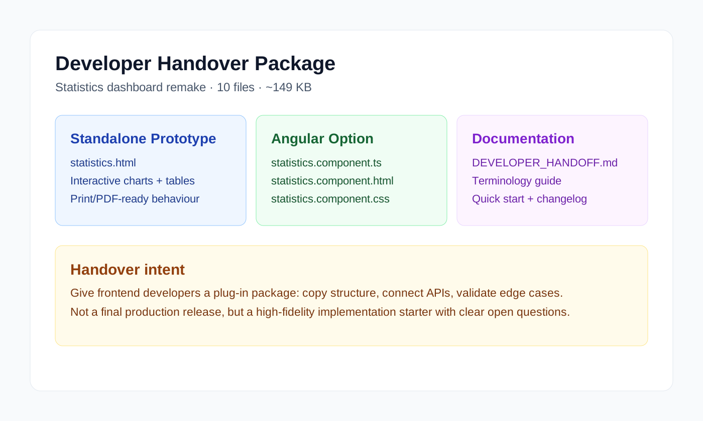
I built the handover package so frontend could start from something that already worked.
- A standalone working prototype,
statistics.html - An Angular component version,
.ts,.htmland.css - Technical handover notes and terminology guidance
- A change log and a quick start
It came to about 149 KB across 10 files, with both the standalone and the Angular route in it.