Gym app check-in, fixing the moving target problem
A small mobile check-in redesign for the frustrating moment when buttons move while options load.
- Context
- UX redesign concept
- Role
- Self-initiated product exercise
- Date
- February 2026
The short version
- Result
- A working prototype in about 30 minutes, and a list of what I'd validate before building it.
- What I did
- Prototyped optional favourites for my gym app's check-in. Pinned buttons keep their place while the list loads.
- The call
- I only changed the moment that goes wrong, and the full list still loads below the favourites.
The moment this is about
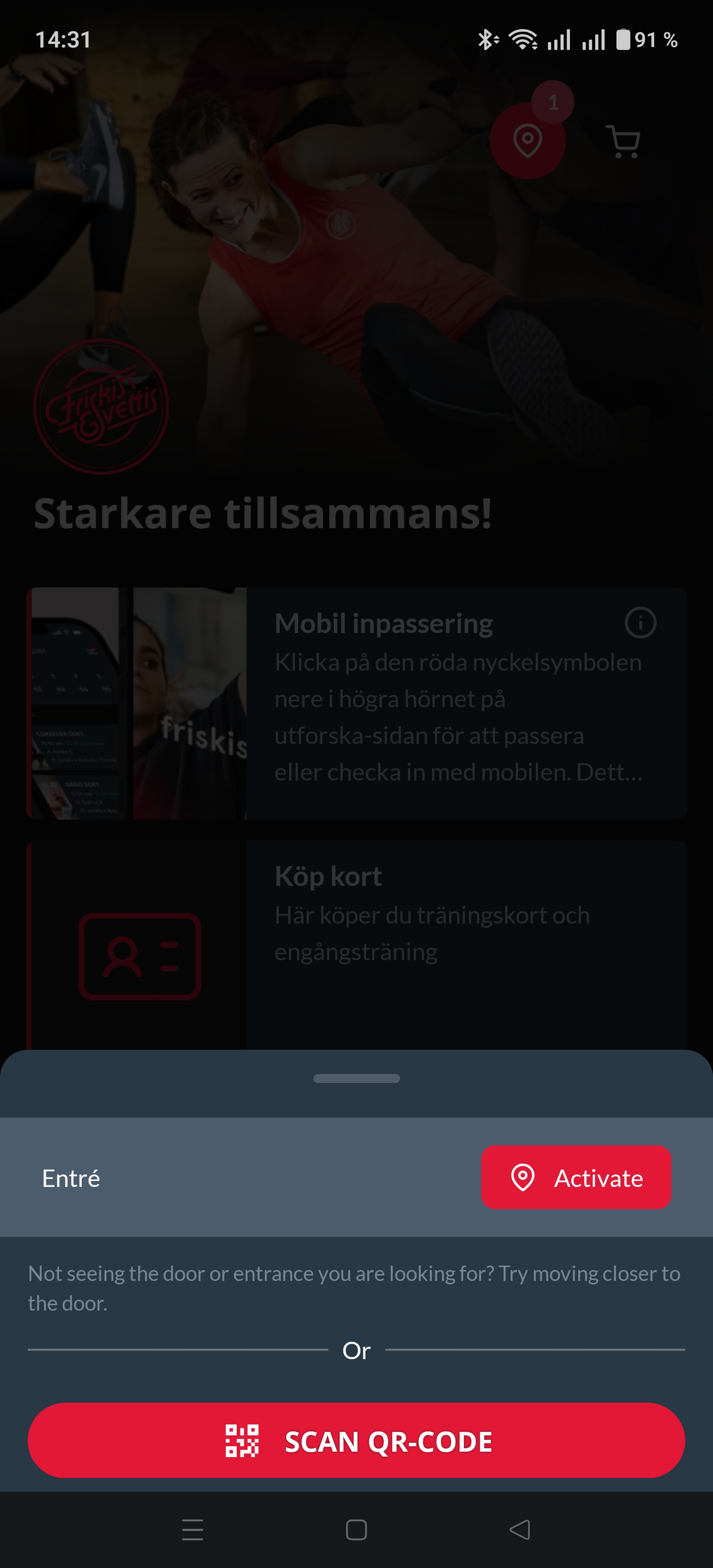
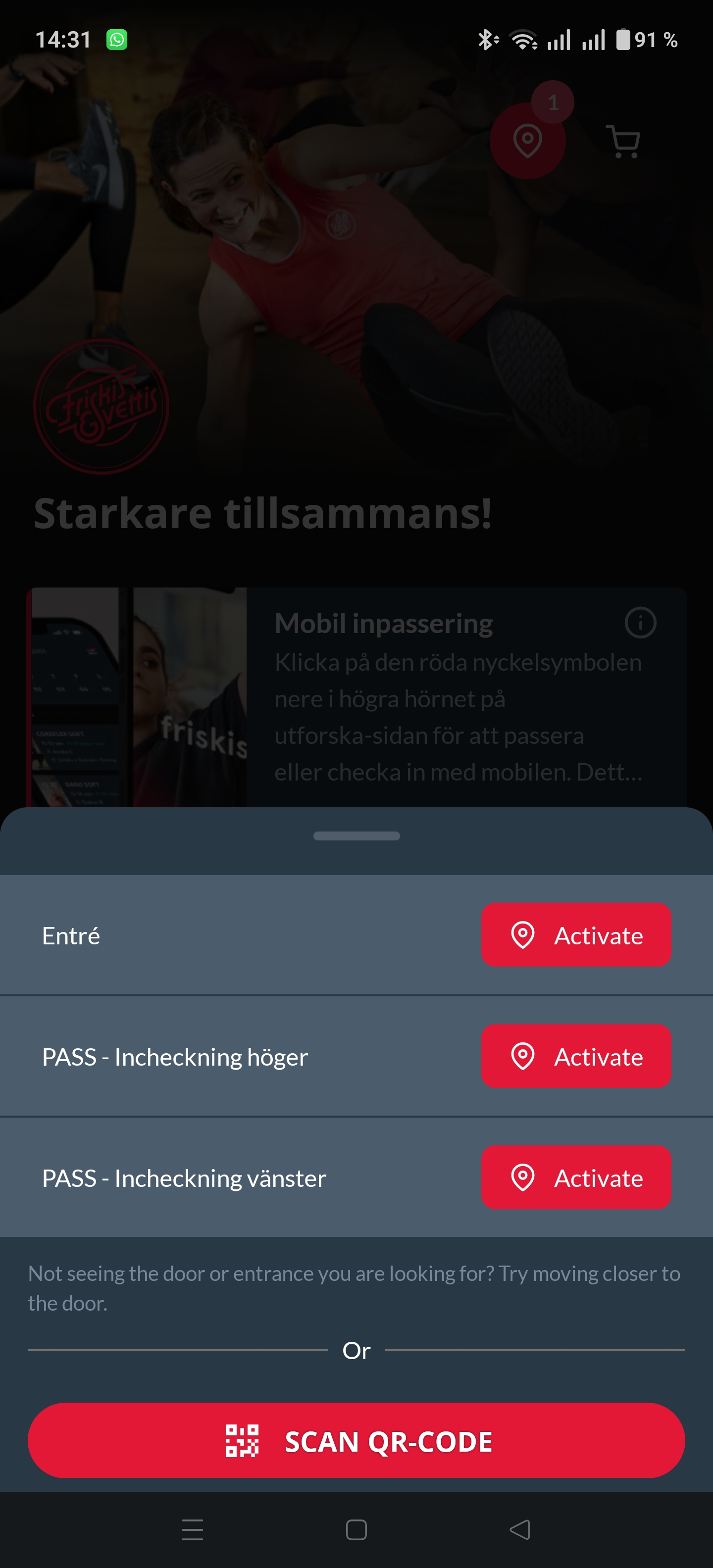
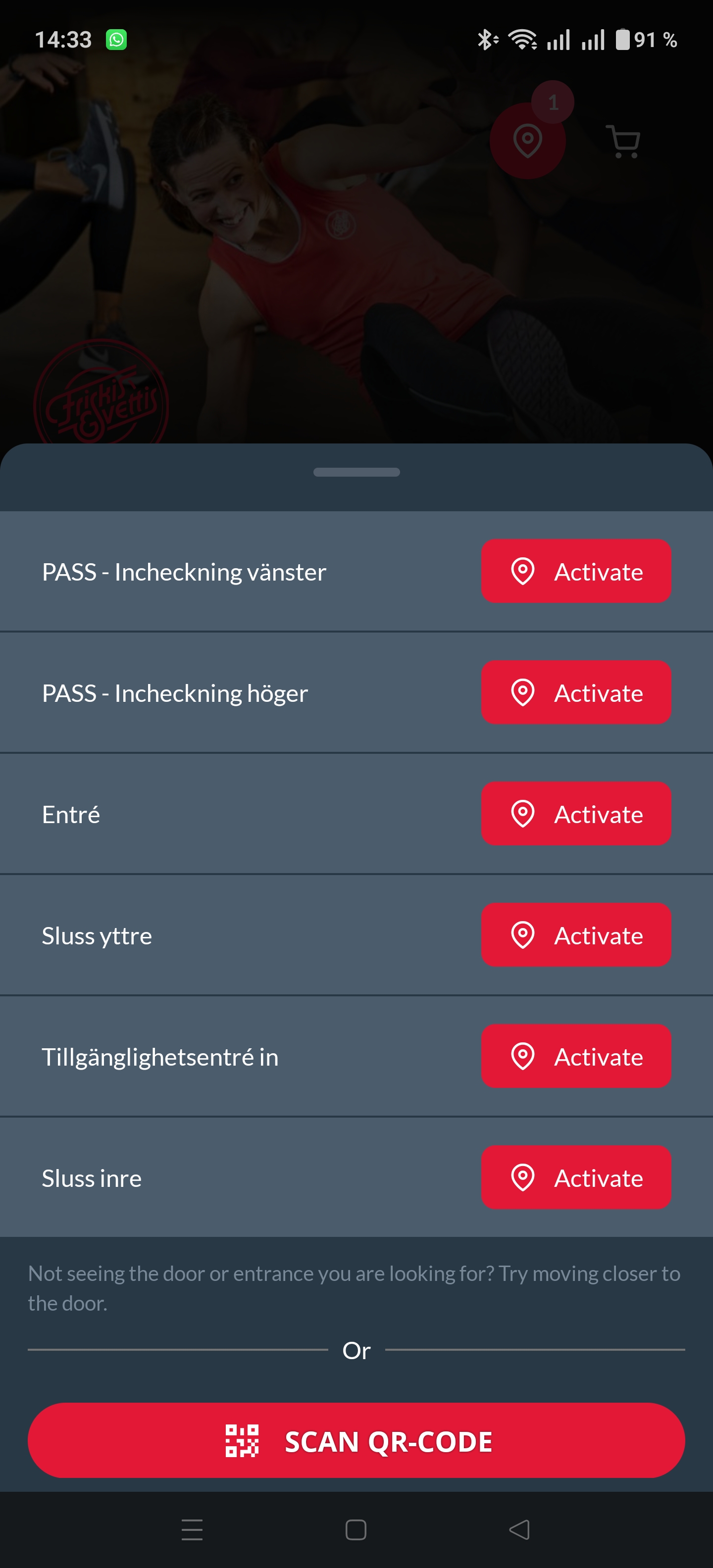
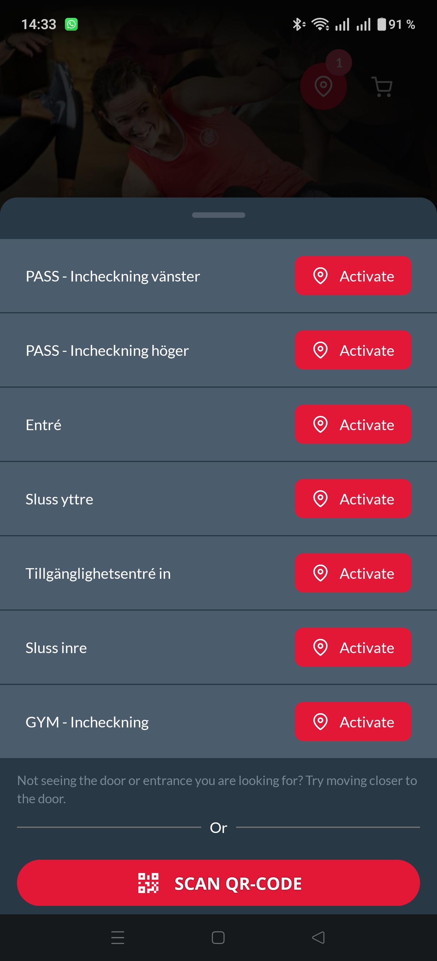
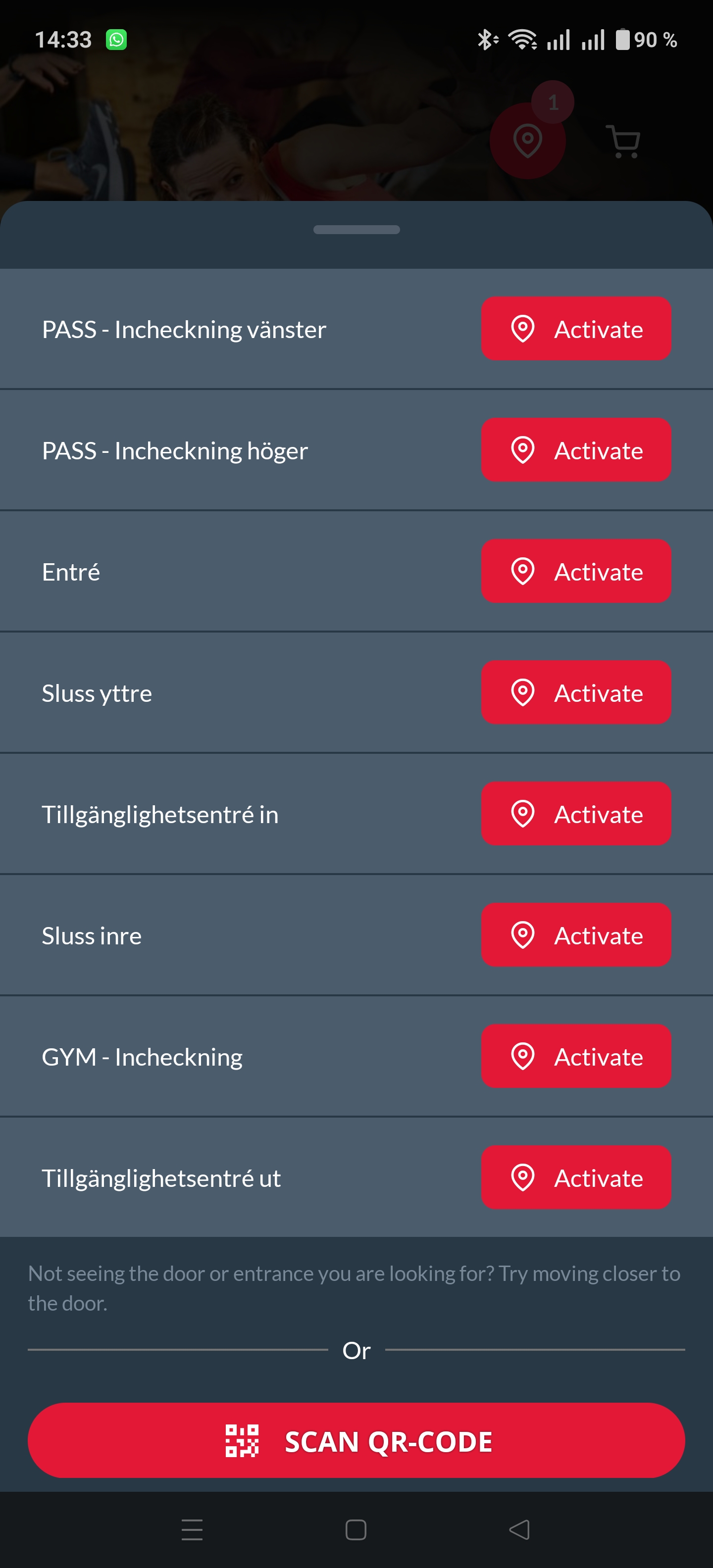
I've used my gym's app for years, and checking in has always worked the same way. I open the app, wait for Bluetooth to find the nearby doors and gates, then rush to tap "GYM - Incheckning" before the list changes.
Prototype
I took screenshots of the real app, wrote the brief with Claude and had Codex build it in planned mode. Within a few minutes the prototype showed both the failure and the fix.
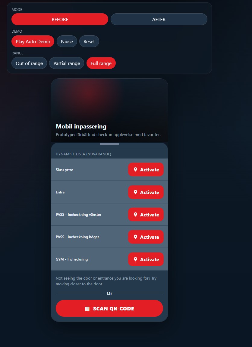
The prototype works best on a phone or in a narrow browser window.
Problem
Every check-in starts with a list of entrances and gates that keeps changing. As new doors come in range they're inserted into the list and the existing buttons move, so I reach for one and tap another, or wait for the whole list to settle first. It's a small annoyance, but it turns check-in into whack-a-mole at the one moment it should be quick.
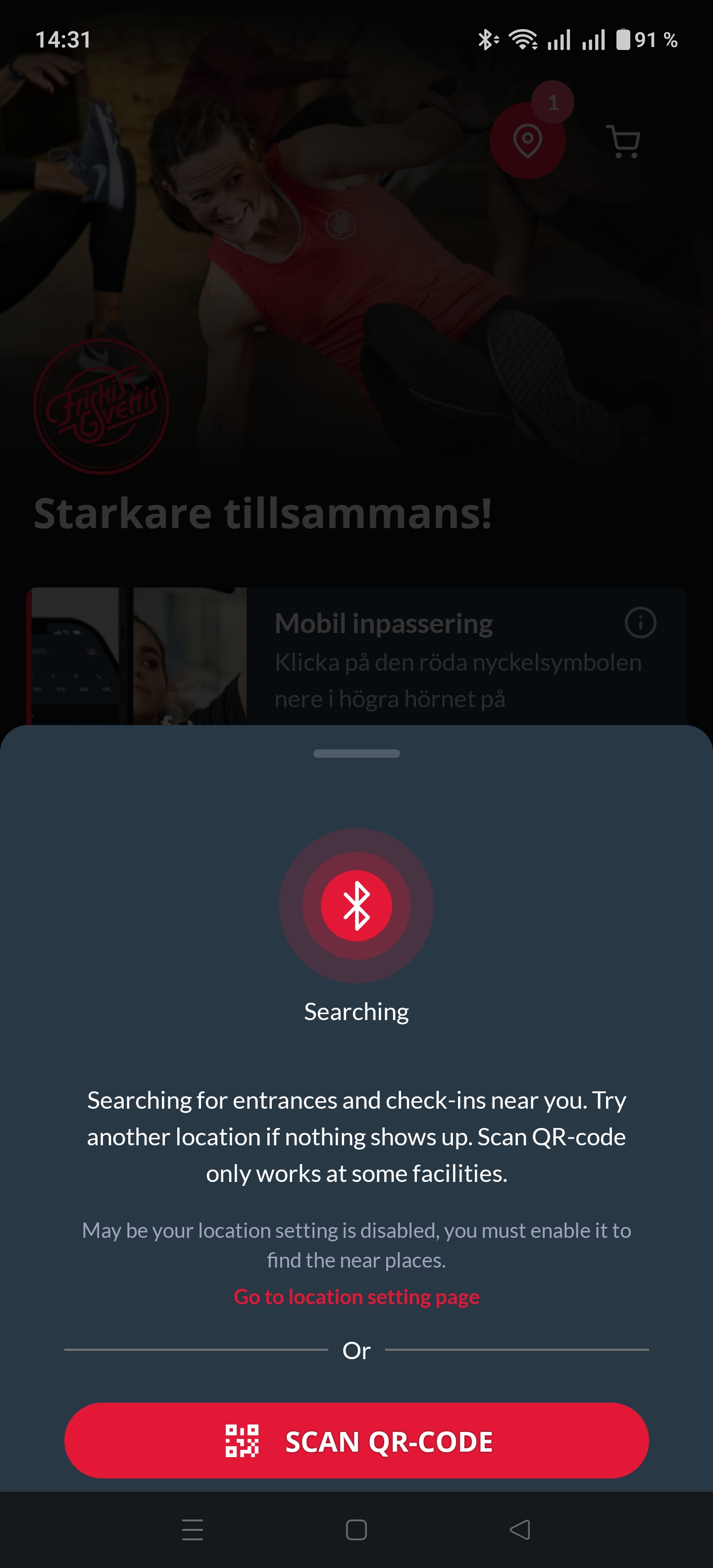
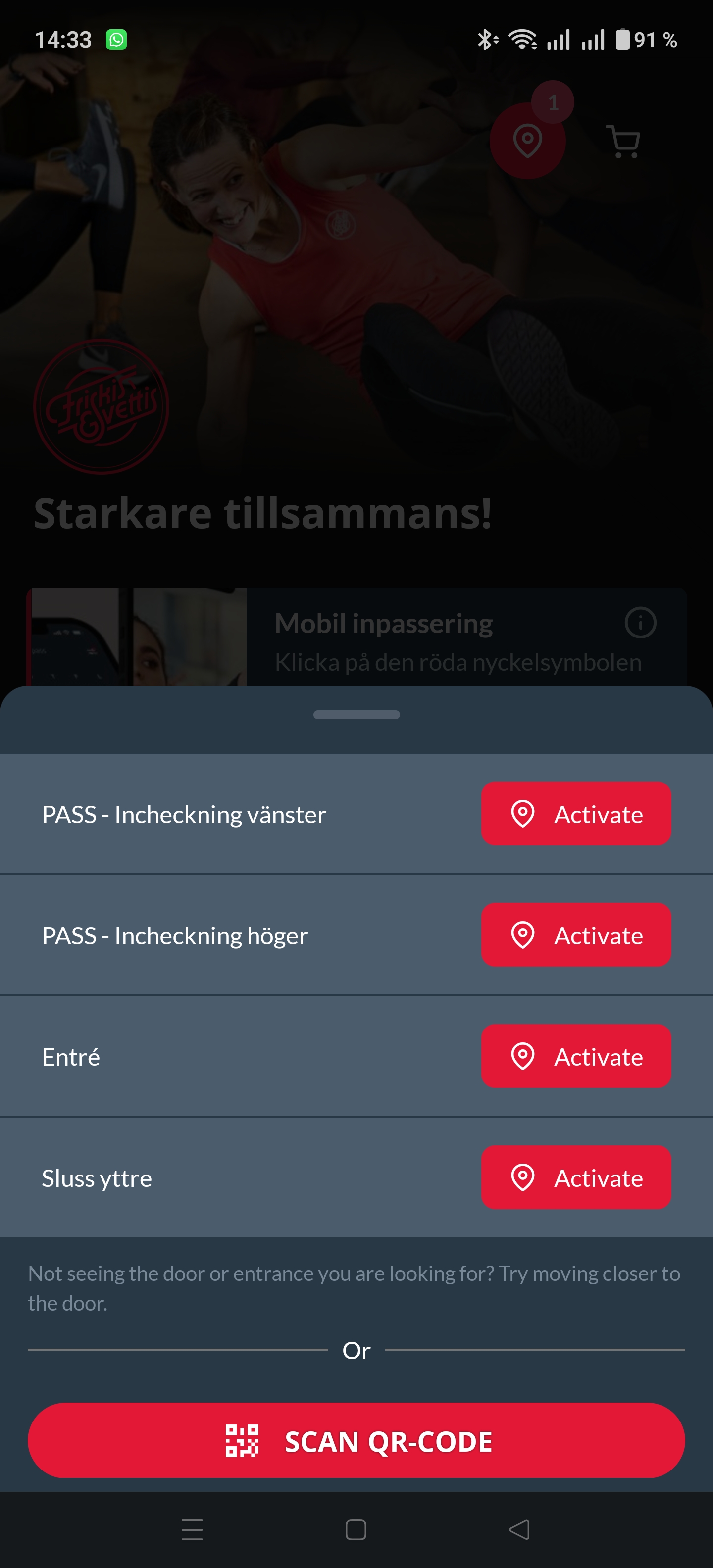
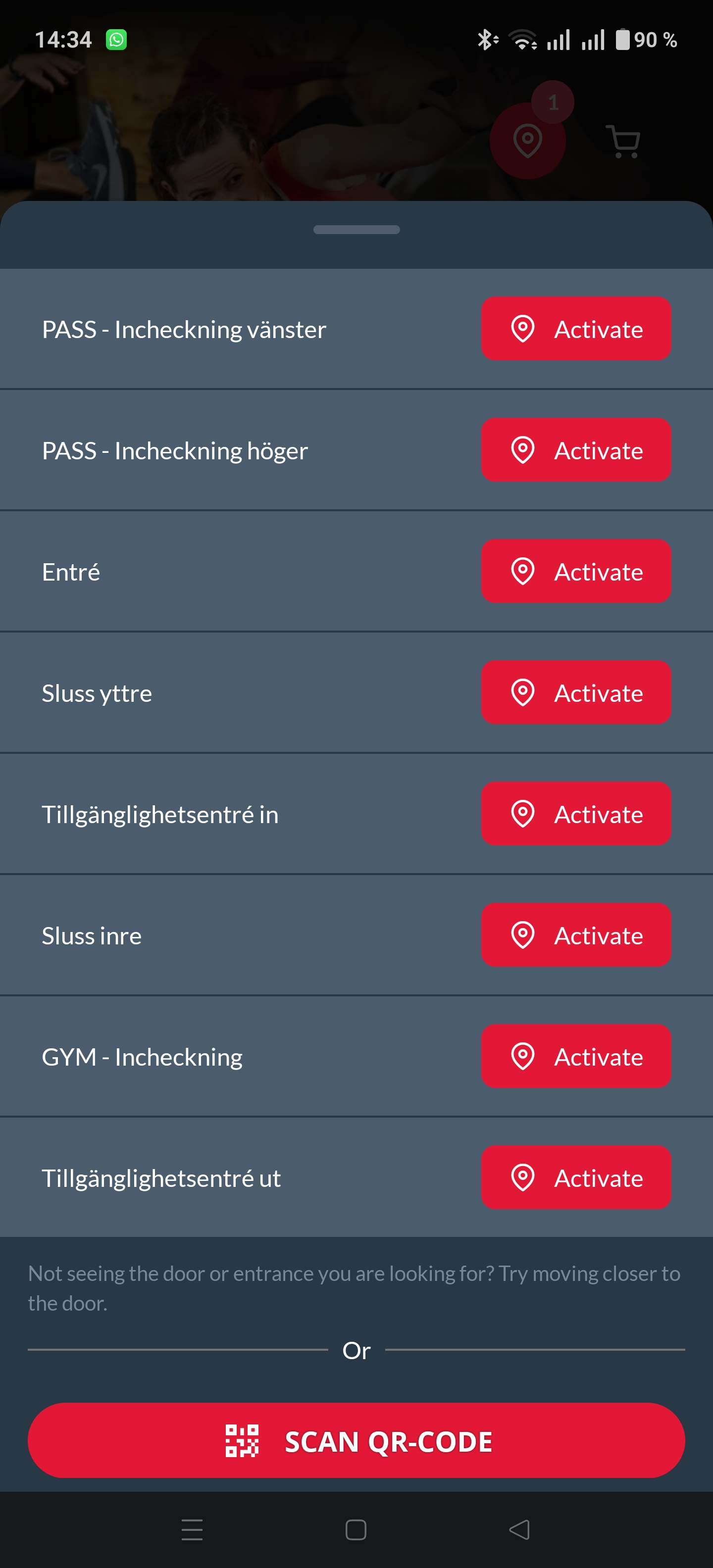
View full 8-screen sequence
Approach
The app favours accuracy over stability. The list always shows exactly what's in range, which is why you can never be sure where a button will be.
I considered three other orderings.
- Alphabetical, which is stable but a poor fit for the action everyone uses most, "GYM - Incheckning"
- Most recently used first, which is personal but still moves around over time
- By time of day, which would work but is over engineered for this
I went with optional favourites. You pin the actions you use to the top of the list, and a pinned item keeps its place. It only changes state, greyed out when it's out of range and red when it's available. Everything else still loads below it.
What I would validate
This is a concept, and it wouldn't bring in any revenue. It would remove an annoyance that keeps coming back. Before pitching it to the gym chain I'd want three answers.
- Should favourites follow you between locations, or belong to one?
- Do people understand pinning at a glance, and the change from grey to red?
- Do enough people pin anything to justify the build, and does check-in get faster or more accurate?
What could come next
If it worked, the app could suggest a favourite once the same action keeps repeating, let you pin with a long press straight from the list, or show rough distance or signal confidence instead of only grey and red. The whole thing took around 30 minutes, including the screenshots and this write-up, and the prototype runs on Vercel.