This website, building my portfolio as a working product
I built this portfolio from scratch with Claude and Codex, and use it to test tone, structure and delivery on something I own.
- Context
- Personal site and portfolio
- Role
- Product Owner
- Date
- April 2026
The short version
- Result
- It's live and part of my own job search, and I keep changing it as I use it.
- What I did
- Built this site from scratch with AI writing the code, and kept the tone, structure and judgement mine.
- The call
- I built it from scratch instead of using a template, so the structure and the wording could be mine.
Problem
I wanted a portfolio that shows how I think and what I've built, and that sounds like me. A tidied up CV or a template with my name dropped in wouldn't do either. I also wanted something real to keep building, testing and fixing, so my product sense stays in use.
Approach
Claude and Codex wrote the code. I kept the tone, the scope, the hierarchy and the call on what stayed.
The loop was short. I'd write or rewrite a section, see it in context, click through the page, notice what felt off, fix the wording, spacing or logic and go again. AI got rough ideas into the browser early, and reacting to something on screen beat discussing an outline for too long.
What I built
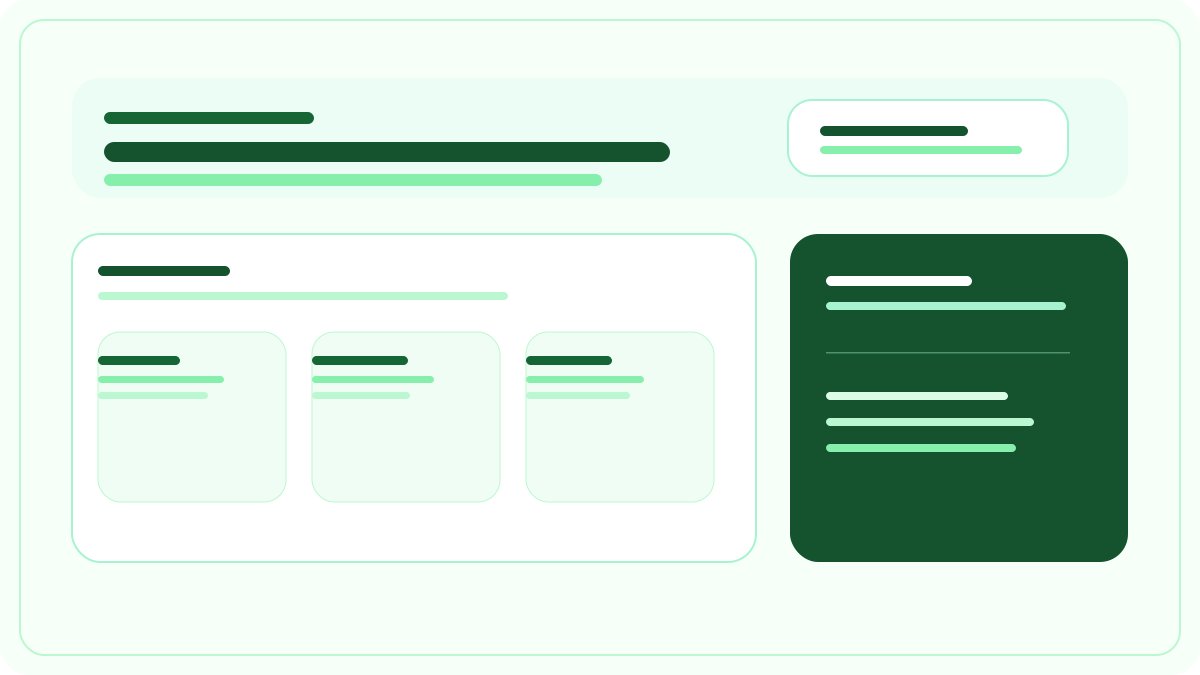
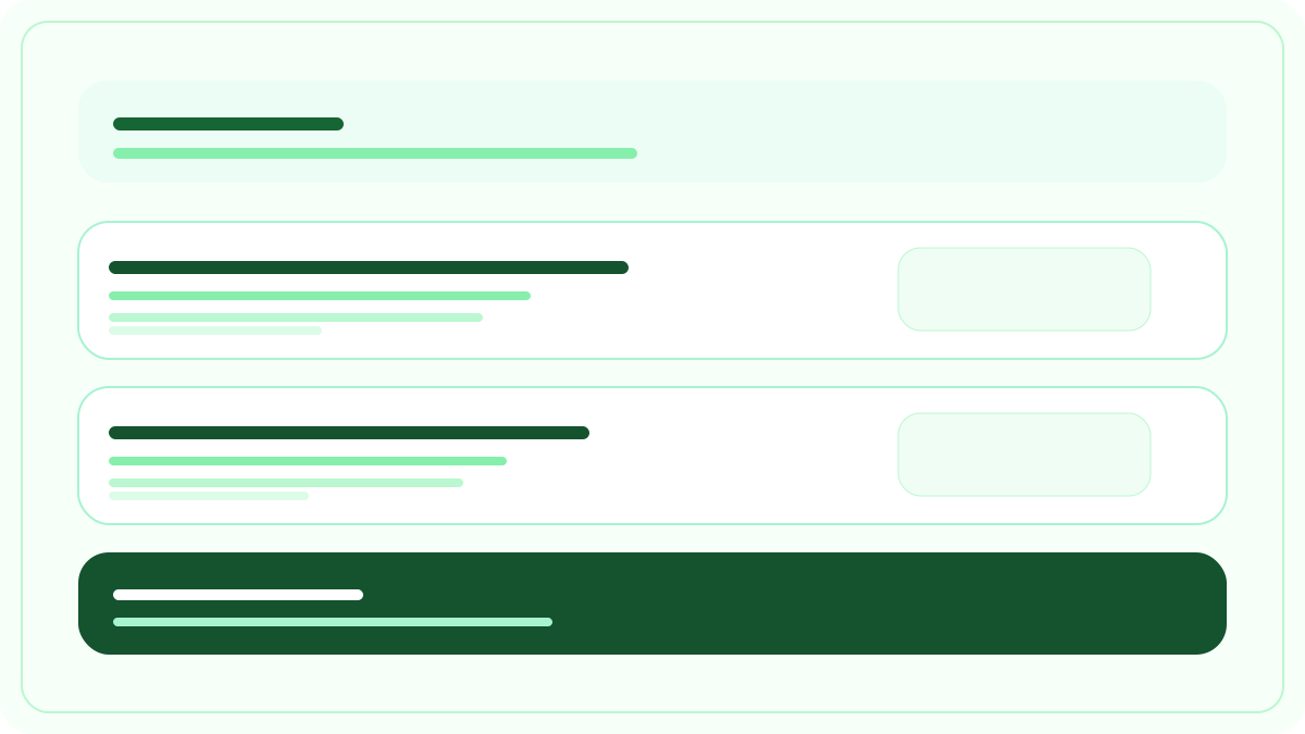
The homepage leads with the builds, then the career work as rows that open on what changed and what it was worth. The examples index groups all fourteen by whether they shipped in a role, were built on my own time or were exercises. Each one has a write-up with a short version at the top, and Archive Lens has a decision log with what I got wrong left in. Method, about and experience pages carry the longer story, and a new example goes in without touching the rest of the site.
The pages have to back each other up. The examples have to support what the homepage claims, and the about page has to add to the story without turning into a corporate profile.
What I kept refining
Most of the work came after the first draft. I kept adjusting the pace of the pages, the wording of headings, the order of the examples and how much each section should carry. A surprising amount of it was getting the tone to sound less rehearsed. The site is also where I fix bugs, navigation, mobile layouts and the small frictions that make a page worse.
- April 2026Reshaped the homepage so the prototyping approach and the proof came through earlier.
- April 2026Reworked the examples copy and order so the page read as work rather than a gallery.
- April 2026Rewrote copy across the site to sound like me and drop the portfolio clichés.
- April 2026Smoothed navigation, spacing and mobile behaviour so the site felt calmer to read.
- April 2026Added this example, so the site documents itself the same way as the other builds.
- August 2026Rebuilt the whole site on a new dark design, with the work list restructured around what each change was worth.
- August 2026Swapped the palette to light and restructured again. Own-time builds now lead the page, and the career work is a compact list of expandable rows.
- September 2026Went over every page for verbal tics and stiff sentences, using the writing rules from Resume Builder as the checklist.
What I learned
Generating sections, layouts and variations with AI is fast. Deciding what sounds true, what belongs on the page and what's trying too hard takes much longer, and it feels like product work. Clicking through something yourself is how you find the unclear transitions, the missing states and the parts that technically work and still feel wrong.